Modern WordPress Website Redesign
Via Arkadia is one of NeaVizion’s first international clients. They are the best provider for premium quality Italian tiles in London. As such we have excellent business collaboration and mutual understanding in the form of website maintenance and upgrades lasting for more than 6 years. Therefore when the need for design upgrade came to Via Arkadia, they looked no further then their longtime partner, NeaVizion.
The new request from Via Arakdia was that their company was in a need of an ultra modern looking website with focus on the best possible product presentation. The product presentation page should have a place for presenteing product photos, product colors, product sizes, brochure as well as a direct order sample form.
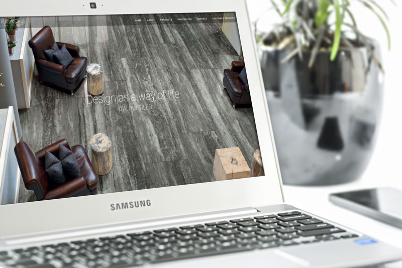
NeaVizion devoted good amount of effort on this as we formed a team of designers and developers which worked in close coordination with the designated Via Arkadia employee. Together we have built one of the most impressive business presentations that we ever did. We created a website which is in a dark “theme” using shades of darker gray. We have also matched our client requirements for good product presentation by designing wide screen modern looking product pages as well as category listings.
Please see few screenshots below or visit the website (link below) to feel the vibe of the new Via Arkadia website.
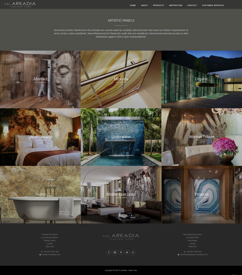
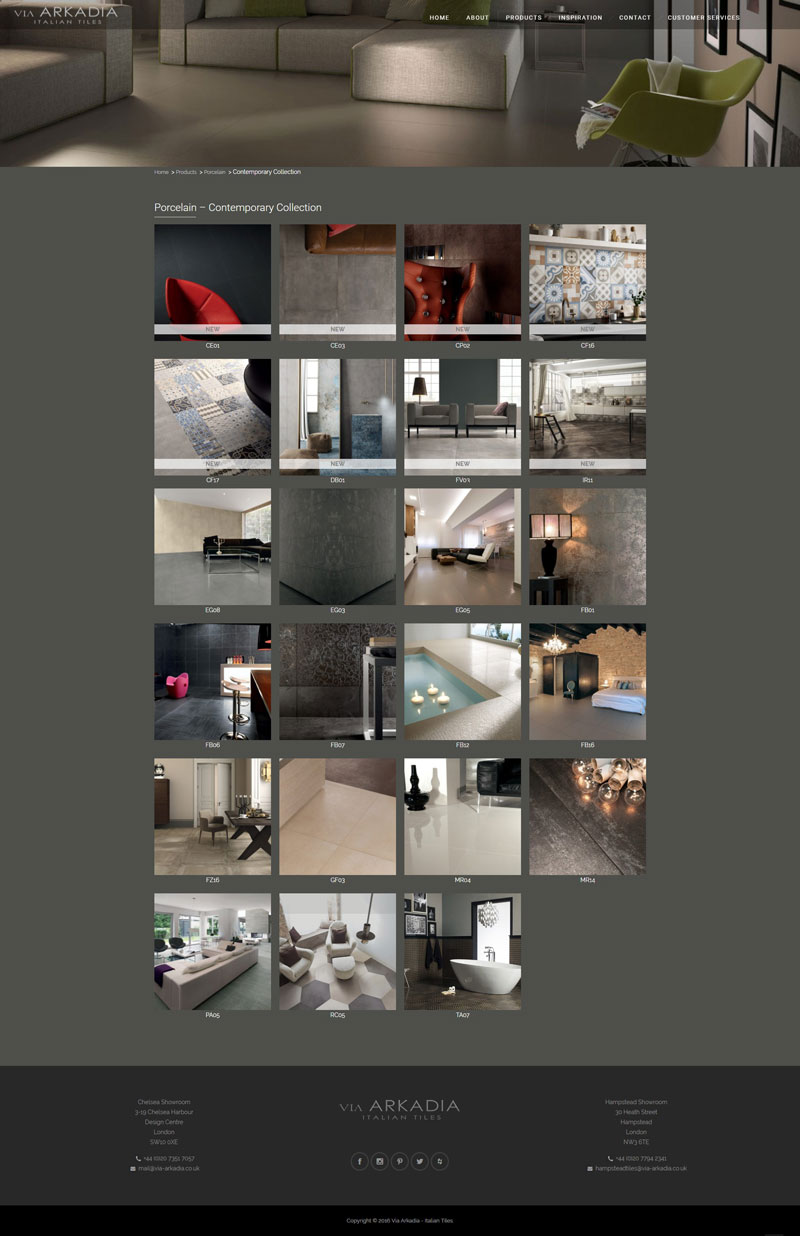
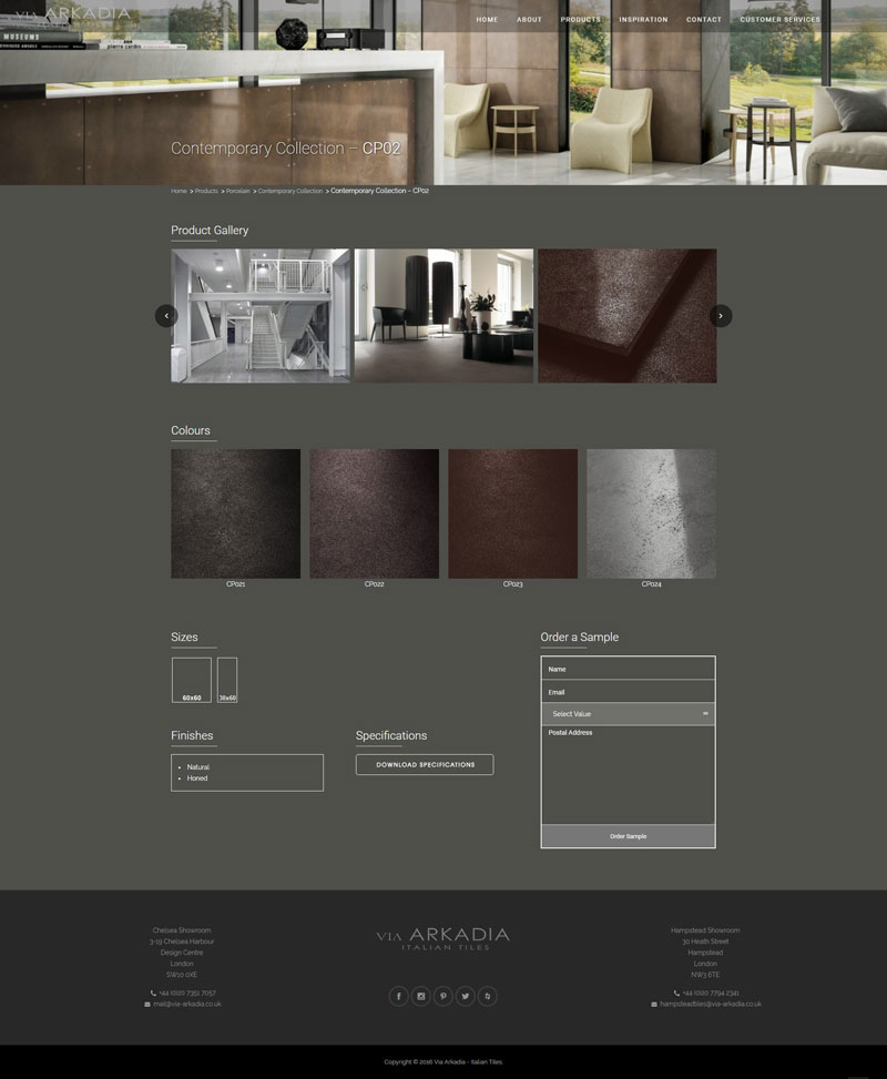
In Our Client’s Words
Our website engagement dramatically improved after using NeaVizion services. Our e-commerce platform hugely benefited from the WooCommerce service and inquires increased further after the WhatsApp service was set up and linked to our website!
Ilan Maestro
Director, Via Arkadia
Like what you see here?
If you like what we have done for this client and you have something similar in mind, or maybe something a bit different, just drop us a message and start the discussion today. We’ll be more than happy to help you achieve your digital success.

