What is Responsive Web Design (RWD)?
What is Responsive Web Design? This is one of the most frequent questions we are getting from our clients every single day. It is a relevant question so we decided to write this short description using simple words so everyone can understand what Responsive Web Design means and what its benefits are.

There are a lot of online articles about it, but we want to speak in the normal, non-geeky language so clients that are not technically familiar with web design terminology can understand if RWD is the right solution for their website or not?
What RWD stands for?
Responsive Web Design (RWD) is a modern and smart approach to developing websites today. The main idea behind this is that the content and the layout of the website would work and would fit any modern device, starting from the smallest mobile (smart) phone displays, then tablets, phablets, laptops, and of course desktop screens. As time goes by web designers must think about adapting the web design to respond to the new devices, their screens, browsers, and technologies including, for example, the latest edition of Smart TVs, meaning that RWD will never stop evolving and adapting. RWD will keep web designers and web developers busy, proactive and always on the frontline of new technology, but the final benefit is that our clients (the website owners) will always be happy with their online presence which will be available everywhere, on any device, any time!
Why Should I Choose RWD?
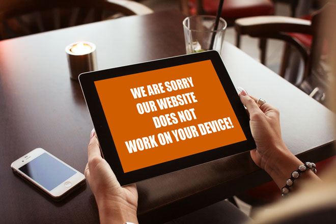
Well, if you’re not using the Responsive Web Approach then you are probably having a tiny little or no presentation on smartphones and tablets presenting a wrong picture about your business to billions of internet users around the world. This by some global surveys means that you are probably missing a big (make that a huge) piece of the internet market today. The users which browse the internet through their mobile phones or tablets are likely to contact your competition instead of you! If this is not enough to convince you to move to responsive web technology then maybe a recommendation by Google will convince you?
What Responsive Web Design means for my website, visually?
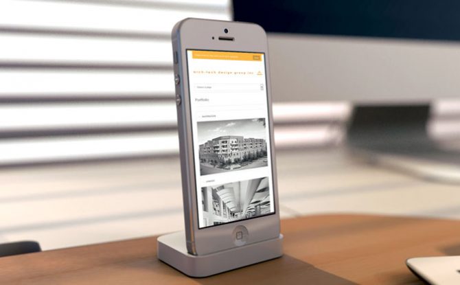
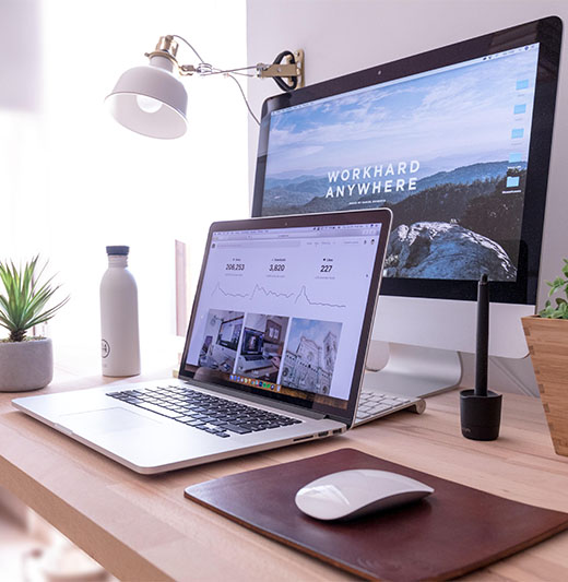
Well, maybe we will explain it better if we try to visualize it for you. Please see the following screenshots from our own website.
Note: If you are visiting our website from desktop/laptop you can see the same screens if you play with your browser size. Just resize your browser in a similar form as our screenshots show and you should be able to see how our site responds automatically to the browser size changes.
- If you see our website on a regular desktop/laptop screen you should see something like this:

- If you are visiting from tablets you should see a slight change in our layout.

- If you visit from mobile/smartphone you should see something like this.

Note that all the time you are seeing the same content, only re-arranged differently. There is no need to create separate content for separate devices. RWD is really the solution to having a modern website for all modern devices!
The main concept here is that during the development stages the web developers make breakpoints for the website. This means that the website is instructed to break the layout in such a way that it fits the device size in a perfect way so the website content can stay large enough, clear enough, readable, understandable, without the need of zooming, unzooming, scrolling left to right and so on. The website first reads the resolution of the display, browser size, and according to that presents the appropriate version of the layout.
Why is Responsive Web Design a better solution than a separate mobile version?
The main principle of RWD and the main advantage to other mobile-friendly solutions is that the website is built in such a way that the final user (the website owner) will only need to enter the content once and yet it will work on every device screen. This differs from the outdated solution of some website owners who have a separate mobile version of their website (there are exclusions where a separate mobile version is a must for some special cases).
In this case, the website owners have completely different websites for displaying on desktop devices and different versions for mobile devices including having different domain/subdomain for the mobile version like http://m.domanname.com. By using RWD there is no need of entering or creating content first for desktop layouts and then create the same content again for the mobile version. All this is avoided by serving the same HTML content from the same domain while making it automatically adapt to any device screen by using CSS styling.
Websites with separate mobile versions also have the problem with URL sharing. For example, if someone tries to share a page from the mobile version of a website (say on Facebook) the shared page will be linked from http://m.domainname.com/page but maybe the person who will click that shared URL might be coming from a desktop computer and yet they will be jumping to a page from the mobile version of the website and will be served with a wrong content delivering bad user experience.
Another issue with the separate mobile versions is that in many cases the desktop and mobile versions look very differently, thus breaking the whole perception of the company brand. This is not an issue with Responsive Web Design.
Apart from this, there is a strong advantage of RWD over separate mobile versions in regard to Search Engine Optimization. There is a strong recommendation by Google to use Responsive Design as a solution for mobile-friendly websites and to avoid using separate subdomains for mobile versions. The same resource provides a list of common mistakes made mostly with mobile versions as there are many cases where the redirection is not configured correctly making more damage than good by providing mobile version to the desktop visitor or desktop version to mobile visitors making bad user experience. Separate mobile versions are a headache for Google too as its crawlers need to crawl both desktop and mobile versions and try to make sense of it all. All this can seriously affect Google in deciding if your website is good enough to be ranked on the first few pages on the search results pages or remove it from there if they notice a big bounce rate from your statistics because of the wrong settings mentioned above.
Remember, the advantage of RWD is that your website will serve the same HTML content from the same domain to all visitors while making the layout adjusted automatically by CSS and arranging it perfectly for the device from which the visitors see your website at that same moment.